Hey, it’s been a while!
With California on lockdown due to the COVID-19 virus, I have some time to work on a few things that I’ve set aside — one, is this blog. This post has been a long time coming as I found out in a Google Keep note from 2018 that listed colorful K-Pop videos. Back then, my daughter was about 2 years into K-Pop and she would watch videos whenever she had some free TV time.
What caught my attention the most, was not only the music, but the visuals in their videos. Granted, I don’t understand a word but I’m starting to catch on (OK, I only know 5 words — but still, something is better than nothing). They truly put a lot of effort in their music videos that it becomes a feast for your eyes.
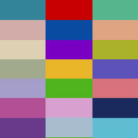
As a graphic designer, my eyes are drawn to color and how it sets the mood. This series of posts will go through K-Pop videos and their color palettes. My goal is to give you palette ideas for whatever project you take on.
I’ve separated the colors by theme and included a small palette preview. Each post will have HEX numbers (for web) and an RGB separation (for screens) to use.
Color Palettes
Throwback
These colors will take you back a few decades. They give you a sense of nostalgia and sentimentality.
 | 90’s Throwback |
 | Rockin’ 80’s |
Sweet Colors
Bright and cheery define this palette. The colors are eye-catching and almost edible.
 | Bubblegum Pop |
Seasons
Winter, Spring, Summer, Fall… Colors to suit the time of year.
 | Emerging Spring |
 | Spring Blooms |
 | Summer Chill |
So I learned some new terms such as “stans” and “bias” throughout all this. These posts aren’t intended to favor one group/artist over the other. However, there are some standouts that are consistent with giving great visuals which is why you might see me lean towards one more than the other.
I like to do my research and have discovered new-to-me and lesser-known artists that put out great work. So as always, if you have any suggestions as to what videos I should check out, please contact me or leave it in the comments!


